Interior Design Color Trends—A Move Away from Gray
Color is one of those interior design concepts that’s constantly evolving. Essentially, some event or some “feeling” inspires a need (or a desire) to change our environment, and sometimes the only aspect of our situation we can modify or control is the color of our immediate surroundings.
One popular theory suggests that interior design color trends are related to what’s happening in our personal lives or to what’s happening around the world. Commercially speaking, color trends are greatly influenced by color experts at Pantone Color Institute, which publishes its Color Trends Forecasting documents every year. Fashion and home furnishing designers, and interior designers all take note when the new colors of the year are released. Cue the cerulean blue sweater scene from movie, The Devil Wears Prada.
Neutral colors of white, cream, gray, beige, and every shade in between have in recent memory been the go-to in the home. This made sense, especially if you intended to sell your house. Colors can be either appealing or off-putting, and these responses are particular to the potential buyer. Thus, keeping color out of the equation increased the chances that someone wouldn’t walk away from the sale because of the bright pink bathroom sink and the golden-vined wallpaper in the guestroom caused them terrible sensory overload.
Recent History of Interior Design Color Trends
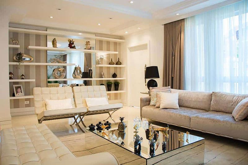
The most popular color in homes over the past five years has been various tones of gray. The appeal of gray was how well it works with other colors you might employ in the fabric of your furniture or wall décor.
However, gray also suggests institutionalization; it’s clinical.
Meanwhile, with the onset of COVID, people were spending more time in their homes than ever before, including working from them, and it’s easy to see how being surrounded by that color for 24 hours could become boring or have a negative effect on someone’s mood.
That’s where color comes in. Whether people are aware of it (or not), color can be inspiring and stimulating. Furthermore, you don’t have to paint an entire room or even a wall to inject color into your home. There are several ways to bring new life or energy into your favorite spaces of your house.
Strategies for Adding Color in Home Decor
For example, here are several ways to introduce vibrant colors into your home without painting or papering a single wall. First decide upon what color or color schemes appeal to you. An interior design mood board is a great place to start.
- Paint your cabinets.
- Add colorful window treatments such as shades, blinds, or curtains.
- Employ marbled or veined countertops.
- Replace the faucets/spouts or the cabinet hardware with new designs and a contrasting color.
- Accent windows or light fixtures with galvanized metals
- Creatively accessorize open spaces with smaller, colorful items like
- Lemons in a jar
- Colorful rugs and artwork
- Vivid dish towels
- Velvet cushions or throw pillows
- Globes or maps displayed in a den or a living room
- Vibrantly colored kitchen appliances
Essentially, these are wonderful ways to breath life into your home’s color palette allow your personality to shine through without committing to painting an entire room.
But for those people looking to take a more aggressive approach to adding color to their homes…
Painting is Still an Option
Spring and Summer Color Trends
There are several gorgeous paint colors gaining the attention of today’s homeowners, and here are three of the Spring and Summer color trends we’re beginning to track from paint manufacturer’s palettes.
1. Soft shades of green
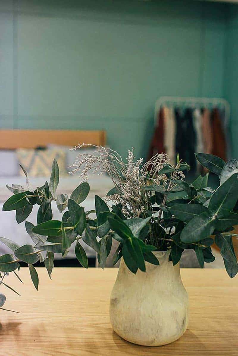
Green was the “color of the year” in 2022 for two major paint manufacturers—specifically, “softer” hues. This might be tied to a heightened awareness of our environment. Generally, there’s a renewed interest in bringing earth tones indoors, and a “mossy” green is an excellent way to express an eco-friendly mentality.
One of the most popular ways softer shades of green are being used is in all-white kitchens. Such hues offer a pop of color with minimal risk, whether you paint the island, add it to the tile on the back splash, or even paint the walls. It’s also a color that looks great with wood floors in the kitchen.
2. Gold, copper, and warm wood grain
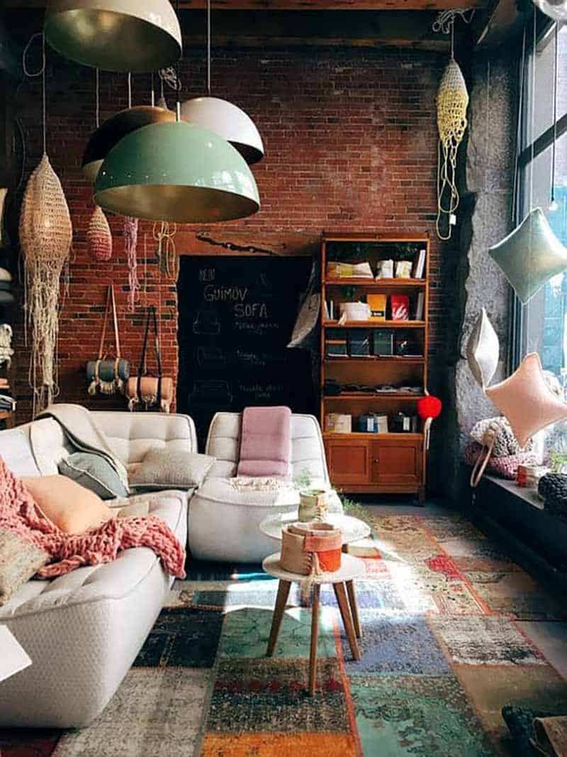
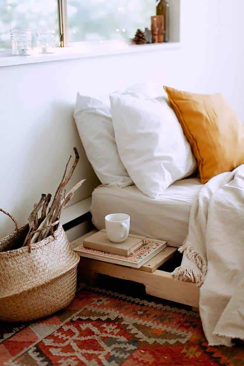
Gold and copper both provide a restrained infusion of warmth into spaces. Where once neutrality was preferred, the pendulum has swung back toward giving a room some character. You won’t want to saturate a room with metallics, but the pop of shine and warmth they can provide is quite appealing. Adding warm wood furniture, flooring, and accent pieces gives a grounded and authentic air to a room.
3. Patinaed red
With paint names like “Ox Blood” and “Sierra Redwood” who can resist taking a look?
What separates such colors from other shades of red is how it looks like it’s begun to age just as you apply it to a wall. Vibrant reds are wonderful as attention-grabbing accents, but when it comes to painting a larger area, modern preferences appear to be leaning into a “lived-in” or even an “exposed-to-the-sun” appearance.
Granted, there’s a sense that neutral tones will always be popular in our homes because we tend to think about houses as more than just where we live, eat, and sleep. For many, they’re our biggest investment. Few people plan to live in the same place for their entire lives. However, this doesn’t mean beige, white, and gray are your only options.
There are so many beautiful colors you can engage to brighten and enliven your home. Just as importantly, there are countless ways to do this subtly if you want to avoid painting and re-painting rooms every few years just to keep up with the latest interior design color trends.
Architecture Podcast Sponsorship / Guest Opportunities
Are you interested in sponsoring The Architecture Happy Hour podcast?
We want to connect with companies that are a good match with the interest of our listeners.
Please complete the Sponsorship section of our Contact Form and we will be in touch.
Laura Davis is a registered architect and interior designer in the state of Texas and Colorado, and a founding member of hpd architecture + interiors. Laura's extensive experience includes residential as well as commercial and retail projects. She also has a particular interest in restoration, holding a certificate in Historic Preservation. She is energized by the character of older homes and the stories of those who have lived there. Responding to the needs of the current owner, while also honoring the personality of the original home is a delicate process to be enjoyed.

